As you may or may not know I am a typesetter. Part of my job as production editor is to layout the interior of a book in InDesign from MS Word, contributing to the design aspects of what goes where and how it lends itself to the text. I work with designers, often, have friends who are designers and artists, and know that for my personal taste when I pick up a book I never heard of what draws me first...is the cover. From there I read the copy and if it interests me I'll add it to my list to read or just buy it on the spot if I've read some lines and am intrigued. But again, what first drew me to pick up this book? The cover. The initial aspect of marketing that you as customer see. What we in publishing aim for is to make the cover/book jacket appear inviting or intriguing, enticing or exotic, unique or fitting in with the trends so it's recognizable. Sometimes we want to shock other times we want something subdued. Of course the author's input counts but doesn't always translate to what makes it to shelves and what you see online.
For me, a cover should capture the intent. As should the interior and the fonts used. I may be getting a bit insidery here, but we think about these things, often. Publishers want to sell books and cater to what makes it different. We want to make the author happy and appeal to an audience while maintaining company style and getting hip with the times. There are a lot of variables when it comes to covers. So I wanted to take a look at some covers I think hit the spot in terms of catching my eye and also in matching the content/tone of a book. I'm going for books I have read so that I can attest to the interior and cover being complementary. (You'll notice that they're pretty current covers.) Here are some faves:
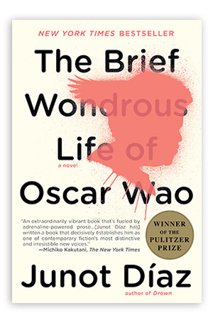
Junot Diaz's covers from Penguin. This is a new 'branding' for his books from his publisher and I like how they match (font, background) so that it becomes uniquely attributed to Diaz as author while also tacking onto a specific element and not being too busy in the front. And particularly I dig Oscar Wao's cover because it maintains the original outline of Oscar's face yet fits in more with the style of the rest of his books.
The Hunger Games series (U.S. covers). I like that even though the hero is a female she's not smacked onto the cover looking perfect and sorrowful. The symbolic nature of the designs illustrates how much the mockingjay pin/symbol plays throughout the series is important and the colors, as you may note, get lighter as the series goes on. From the bleakest of bleak in black, to red which can also mark the blood shed in Catching Fire, to the blue of Mockingjay that is soothing and calm not too bold like a navy blue but more a powder one gives some hope and shows the mockingjay not as pin but as a living bird in flight. Symbolism up the ying/yang! If you take a look at some of the international covers you will see some with a young girl in the woods of the first book or a young man and I think it takes away from the detriment when you can see the characters' faces for this particular book. The elements that signify the change and rebellion of Panem work well with the backgrounds, colors, and metaphors.
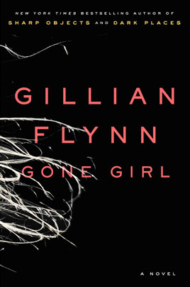
Gone Girl. In a word: creeptastic. The title itself is eerie and leads me to think nothing good, add a cover of a black background and strands of hair leads you to also think "not good." Gillian Flynn's previous books (Sharp Objects & Dark Places) also got a cover redesign to fit in with a kind of theme just like Diaz's publisher did for his. Hers are black backgrounds and again a single element tying into the content of the story and the representation of a dreary world and the people that reside in it.
Tampa (UK cover). Well, considering the content that UK cover is another note on the representation that is subtle yet all the more alluring. The innuendo is evident and works as a wink to the reader of what we can/can't say. Also, the pink! That color shirt and the open button hole hit the aspects of the protagonists unbridled and unashamed desire perfectly. Fantastic.
Lucy Variations. I like the cover because of the simplicity of it but also how the elements and colors work and how, unlike many YA covers, it focuses on what the character lost by showing her hands at the piano. With Lucy Variations the piano is at the heart of Lucy's story and it fits in while standing out from what else is out there for YA books.
Between Shades of Gray (original hardcover, U.S.). The wires, the ice, the one colorful sign of life growing through the snow/ice lends every bit of sorrow and hope to this tragic story. It enhances and symbolizes what Ruta's novel is, which is harrowing but able to find a brightness to it. Love it.
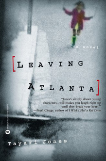
Leaving Atlanta (hardcover). Another cover that portrays the ominousness of Tayari Jones' debut well, especially with the font having a typewriter style which can be seen as dated (which the story is looking back at murders of children in Atlanta in the 1980s) to also reflecting the fact that this was a major news story. The grays and darker tones add to the bleakness of the story but then you have a cute child in a red jacket skipping down the street. This seems like the calm before the storm and definitely helps depict the innocence of children and the danger of the time.
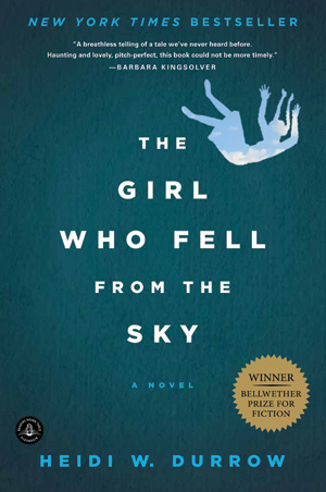
The Girl Who Fell From the Sky. This cover illustrates the content well and I'm a fan of teal in general. What the paperback copy does well is that it also includes the sky as the interior to the image of the girl falling, a nice touch. The book centers on the main characters coming-of-age as a teen being raised with her grandmother after her mother did a pretty brutal and tragic thing to her children. As sole survivor this girl is known as the girl who fell from the sky and survived and it's a hard title to carry as you're trying to come into your own. So the cover and title clearly illustrate the protagonists past and how that may define her future.
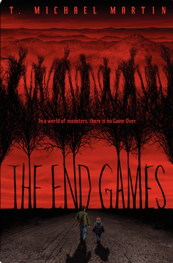
The End Games. When Mike first showed me this cover I was bowled over. The illustrations, the background, the horrible eerie things stretching out of the land noting how the terror can be outside and in your mind along with the red makes it a real standout. And you don't see as many illustrated covers these days. The two brothers, one older protecting the younger heading into the unknown is the epitome of what a good horror story should invoke.
