Your Custom Text Here
Design Post: Let's Talk Book Covers
The visuals of a book mean as much as the content. The saying "Don't judge a book by it's cover" is apt in many instances but when it does come to books, let's be frank, that what we see does draw the eye. So, I wanted to look at a few book covers that appeal to me as someone who works in the industry as well.
As you may or may not know I am a typesetter. Part of my job as production editor is to layout the interior of a book in InDesign from MS Word, contributing to the design aspects of what goes where and how it lends itself to the text. I work with designers, often, have friends who are designers and artists, and know that for my personal taste when I pick up a book I never heard of what draws me first...is the cover. From there I read the copy and if it interests me I'll add it to my list to read or just buy it on the spot if I've read some lines and am intrigued. But again, what first drew me to pick up this book? The cover. The initial aspect of marketing that you as customer see. What we in publishing aim for is to make the cover/book jacket appear inviting or intriguing, enticing or exotic, unique or fitting in with the trends so it's recognizable. Sometimes we want to shock other times we want something subdued. Of course the author's input counts but doesn't always translate to what makes it to shelves and what you see online.
For me, a cover should capture the intent. As should the interior and the fonts used. I may be getting a bit insidery here, but we think about these things, often. Publishers want to sell books and cater to what makes it different. We want to make the author happy and appeal to an audience while maintaining company style and getting hip with the times. There are a lot of variables when it comes to covers. So I wanted to take a look at some covers I think hit the spot in terms of catching my eye and also in matching the content/tone of a book. I'm going for books I have read so that I can attest to the interior and cover being complementary. (You'll notice that they're pretty current covers.) Here are some faves:
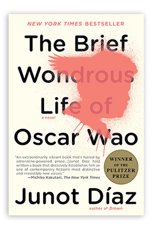
Junot Diaz's covers from Penguin. This is a new 'branding' for his books from his publisher and I like how they match (font, background) so that it becomes uniquely attributed to Diaz as author while also tacking onto a specific element and not being too busy in the front. And particularly I dig Oscar Wao's cover because it maintains the original outline of Oscar's face yet fits in more with the style of the rest of his books.

The Hunger Games series (U.S. covers). I like that even though the hero is a female she's not smacked onto the cover looking perfect and sorrowful. The symbolic nature of the designs illustrates how much the mockingjay pin/symbol plays throughout the series is important and the colors, as you may note, get lighter as the series goes on. From the bleakest of bleak in black, to red which can also mark the blood shed in Catching Fire, to the blue of Mockingjay that is soothing and calm not too bold like a navy blue but more a powder one gives some hope and shows the mockingjay not as pin but as a living bird in flight. Symbolism up the ying/yang! If you take a look at some of the international covers you will see some with a young girl in the woods of the first book or a young man and I think it takes away from the detriment when you can see the characters' faces for this particular book. The elements that signify the change and rebellion of Panem work well with the backgrounds, colors, and metaphors.
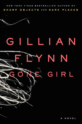
Gone Girl. In a word: creeptastic. The title itself is eerie and leads me to think nothing good, add a cover of a black background and strands of hair leads you to also think "not good." Gillian Flynn's previous books (Sharp Objects & Dark Places) also got a cover redesign to fit in with a kind of theme just like Diaz's publisher did for his. Hers are black backgrounds and again a single element tying into the content of the story and the representation of a dreary world and the people that reside in it.

Tampa (UK cover). Well, considering the content that UK cover is another note on the representation that is subtle yet all the more alluring. The innuendo is evident and works as a wink to the reader of what we can/can't say. Also, the pink! That color shirt and the open button hole hit the aspects of the protagonists unbridled and unashamed desire perfectly. Fantastic.

Lucy Variations. I like the cover because of the simplicity of it but also how the elements and colors work and how, unlike many YA covers, it focuses on what the character lost by showing her hands at the piano. With Lucy Variations the piano is at the heart of Lucy's story and it fits in while standing out from what else is out there for YA books.

Between Shades of Gray (original hardcover, U.S.). The wires, the ice, the one colorful sign of life growing through the snow/ice lends every bit of sorrow and hope to this tragic story. It enhances and symbolizes what Ruta's novel is, which is harrowing but able to find a brightness to it. Love it.
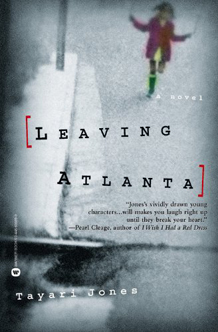
Leaving Atlanta (hardcover). Another cover that portrays the ominousness of Tayari Jones' debut well, especially with the font having a typewriter style which can be seen as dated (which the story is looking back at murders of children in Atlanta in the 1980s) to also reflecting the fact that this was a major news story. The grays and darker tones add to the bleakness of the story but then you have a cute child in a red jacket skipping down the street. This seems like the calm before the storm and definitely helps depict the innocence of children and the danger of the time.
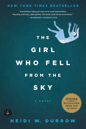
The Girl Who Fell From the Sky. This cover illustrates the content well and I'm a fan of teal in general. What the paperback copy does well is that it also includes the sky as the interior to the image of the girl falling, a nice touch. The book centers on the main characters coming-of-age as a teen being raised with her grandmother after her mother did a pretty brutal and tragic thing to her children. As sole survivor this girl is known as the girl who fell from the sky and survived and it's a hard title to carry as you're trying to come into your own. So the cover and title clearly illustrate the protagonists past and how that may define her future.
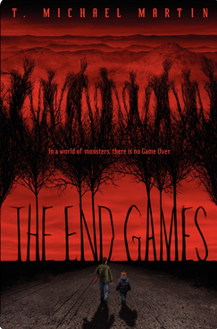
The End Games. When Mike first showed me this cover I was bowled over. The illustrations, the background, the horrible eerie things stretching out of the land noting how the terror can be outside and in your mind along with the red makes it a real standout. And you don't see as many illustrated covers these days. The two brothers, one older protecting the younger heading into the unknown is the epitome of what a good horror story should invoke.
Book Expo 2013: How's the Publishing Industry Faring Since?
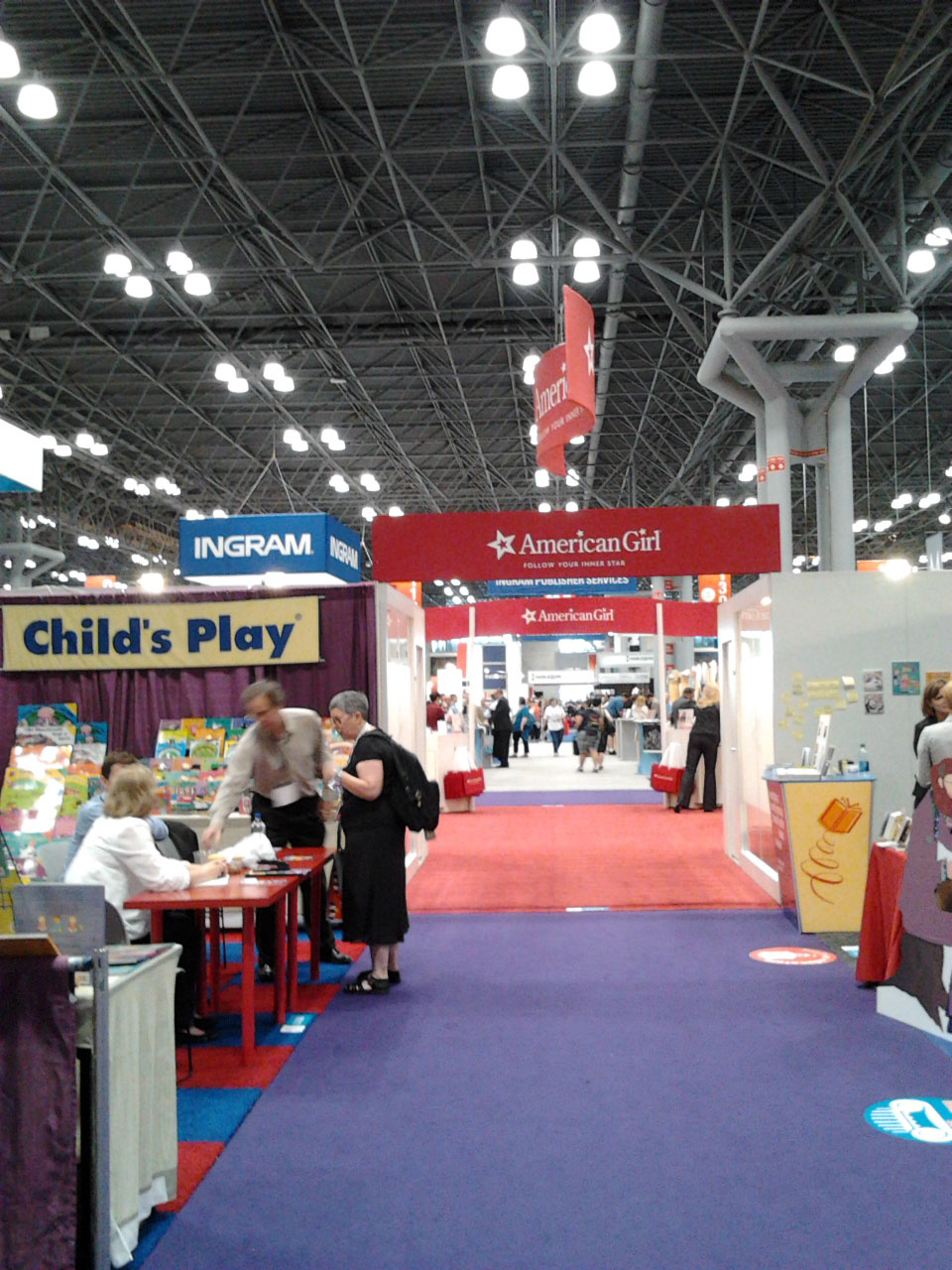
Once again Book Expo was held in NYC during a hot (and semi-humid) few days. There was talk about the state of the industry and digital components (and vendors) had a key area in the Digital Zone. What is the state of the industry or really prospects on the state? Hopefully ever optimistic and growing.
Well now that almost two months have passed since BEA, Penguin Random House has officially merged, there've been layoffs at academic publishers such as Wiley and Pearson, and who knows what more may come especially with the DoJ agreement keeping Amazon from owning a good portion of the industry in terms of rights. But, as always around Book Expo of America (BEA) time the outlook for the publishing industry and state of books is optimistic and favorable. But you wonder is this because of the BEA crowd being booksellers, librarians, bloggers, publishing professionals, authors, agents, and the like or because now that there's a day for Super Readers as well extends to people who just have a love for books?
This year BEA was very giving. And while there were rumors of some houses having significantly smaller booths than last year I didn't see much that was different from the past two years before at Jacob Javits Center. Random House had a good sized booth away from the cluster of the big six which helped them move and start lines in the autographing area. And many signings had huge turnouts and waits, particularly those for Rainbow Rowell's latest, Fangirl. The acclaim for Eleanor & Park (St. Martin's Griffin) sent fans standing in line for up to an hour just to get a chance to take a picture of the author whose lovely smile and comical and searing prose was worth the wait.

Rick Yancy's The 5th Wave (Penguin Teen) and Sarah Maas' latest in the Thrown of Glass series (Bloomsbury YA) drew huge crowds and waits before hand as well. And that's just a bit of proof of how much young adult titles continue to grow favor and lines at Book Expo with YA authors being a good portion of those doing signings.
Scholastic Editorial Director and author David Levithan signed two of his new/upcoming titles, one of which is the gorgeously elegiac Two Boys Kissing (Knopf for Young Readers). Veronica Roth signed posters for Allegiant (Book 3 in the Divergent trilogy, Katherine Tegen Books). Marie Lu signed samplers for Champion, the last book in the Legend series and she'll be gearing up for her new series with Penguin due out fall 2014.

Algonquin had a YA takeover at their booth one of the days of BEA in celebration of their new Young Readers imprint that will have debuts this fall. Two of their titles were on the YA Buzz Panel. Hitting the 30 year anniversary it seemed apt that a new imprint could bring a new face to Algonquin. And one of the big draws and titles talked about on the Buzz Panel were If You Could Be Mine about two girls in a relationship in Lebanon and the MG book The Time Fetch. And even Tuttle Publishing which is known for it's books bringing Asian education and flair to the marketplace has YA books they were promoting alongside many of their popular cookbooks. And with Paleo becoming a bigger contingent in the cookbook scene Tuttle Publishing has that covered.
There was also the literary contingent with Andre Dubus III signing a new book out with Norton. Elizabeth Gilbert signing her new fiction title with Penguin. Giveaways for National Book Award winner Jesmyn Ward's latest, a memoir entitled Men We Reaped about the men she's lost in her life and her life in the South. Colum McCann signed hard copies of his first book since he won the National Book Award in 2009, Transatlantic. Add in the talkative Adriana Trigiani and Jason Mott whose debut The Returned from Harlequin imprint Mira has been getting raves and there's a well-rounded amount of authors for a diverse audience. There was the hype for Burial Rites a debut from Hannah Kent and Wally Lamb's latest along with Son by Phillip Meyer. And Neil Gaiman didn't just have a children's book he was promoting and signing he also had an adult one (The Ocean at the End of the Lane) and drew a HUGE crowd on Saturday morning for his talk on writing and the business along with a signing afterwards.

Amy Tan was there to speak of her new book due out in November. Jim Carrey had a fast-moving line curling around Perseus's distribution booths for signing of posters for his first picture book for kids and Chelsea Handler was there for photo ops. Julianne Moore had another children's book she was promoting and Giada De Laurentiis signed her first children's book as well called Recipes for Adventure with an imprint at Penguin. But the biggest star seemed to be Grumpy Cat who had about a 45 minute wait for a picture beside him. But you could not touch the cat. At all.
So that's the fun stuff, but what about the business of publishing? How is that going? Ebook sales are rising but still do not make up a huge portion of the market. They take up 15-20% of sales in trade and many independent presses and small university presses are trying to find a piece of that pie. Making the Digital Zone and coinciding conference IDPF huge draws for industry professionals to get to know what's available on the digital side and how they can reap the benefits for low costs.
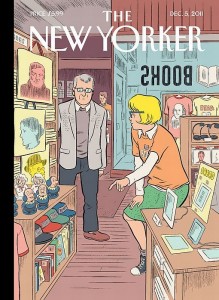
Even with sales not taking a huge piece of the pie like expected ebooks are and will continue to be very important to the market. Kobo, one of the lesser known e-readers may soon be striking a deal with the American Booksellers Association (ABA) to distribute their ebooks exclusively with independent stores helping both parties in one swoop. One of the detriments of the indie store has been competing in the digital market and a contract with Kobo can improve that. I mean look at this New Yorker cover (below). Doesn't that say enough about the state of the indies? Especially indies in big cities like NYC where ones pop up but need a steady base of customers to continue to go to. And in places like Queens and the Bronx we do not have many if any.
From the agent perspective, especially if you follow the Twitter-verse and look at new books coming out in the Young Adult realm certain trends are slowing and others are surging. Amy Tintera's Reboot and T. Mike Martin's The End Games both play off of zombies, which may be the new "thing." Dystopian is losing ground but there are still new ones coming out like Joelle Charbonneau's The Testing series from HMH Kids. And aliens are making a comeback! (See the popularity of The 5th Wave and also Malinda Lo's sequel to Adaptation.) Maggie Stiefvater's latest in the Raven Cycle series was a huge item up-for-grabs and traipses along a new line of fantasy and mystery and the hunt for a mystical king. Whereas contemporary YA is gaining ground and will always have relevance (note what I said about Rainbow Rowell's line).
Mysteries and their big name authors like James Patterson and Preston & Child had ARCs flying off the floor. And with the Readers Day on Saturday people went buck wild about the freebies.
More MG is being sought by publishers and agents. More specific stories and non-recycling of themes we've seen/heard/read before. It's becoming harder to become unique if in certain instances trends are the thing but good writing is good writing and books is what excites everyone about BEA in the first place.
So what is the outlook on the publishing industry? Well, it has ebbs and flows as any business does. Super Readers on Saturday proved to be big fans and also those in education seeking out titles to give to students and promote reading. Books will always be a necessity whether for entertainment, inspiration, or education. And BEA tends to remind those of us in the industry how much people enjoy it and how important it is. Yes, people get very grabby hands at BEA and there is shuffling of bodies and pushing of arms and taking of items clearly marked for sale but in the grand scheme of things it's about books and book lovers and uniting them for a celebration of the industry not just an analysis of it.
Time will tell what the (immediate) future holds for publishing. A lot of predictions made don't come to fruition. A lot of sites in beta may or may not be the next huge thing. And many books predicted to be hits may flounder and those that barely got any publicity may surge due to word of mouth from various people in the community. There's no true tell-tale sign except that publishing needs to be malleable and change with the times while consistently seeking to produce great content and find the audience for it.
For next year and the year after BEA will still be held in New York City at Jacob Javits before going off to Chicago for a year or maybe more. It's been really nice having BEA in my hometown/backyard for the past three years straight and I'll continue to enjoy it no matter the locale.